What the heck was I thinking?!
by Charles D.J. Deppner
Although I’m not usually in favor of writing with direct reference to myself, (If you note, with the exception of stories which may be told by its characters- the only one being “Ballad of G.I. Fro”- none of the stories of are told in my person.) in order to fully exploit this column to its full potential, I’ve decided to start a new section of the column for those truly interested in how I feel, work, and think- this includes my own interest as well.
This section will cover primarily how and why I conceptualize and execute “Iceberg Defect.” However, I use it, from time to time, as a means of furthering my opinion on a variety of topics. This record will serve as a record not only for myself, but for all those interested.
Please realize that this page, as well as the “archives” are done in reverse chronological order. However, this section is done as an afterthought, (post-“Elusive Truths…”) so forgive it if the chronology in cross-referencing is a tad screwed.
Now, on with the show…
“Braille Maps”
When Green Goblyn asked me to contribute some artwork to their new CD release, I was more than flattered. I was compelled to do something which would have mutual importance to both the band and myself- which can be a pressure-cooker unto itself.
Christ had already picked a name for the, so upon realizing this I tossed everything out the window and started over.
Fortunately, the idea manifested somewhat instantaneously. Obviously, a somewhat not-so-subtle to the great Tim Robbins’ film Bob Roberts.
If you haven’t seen it, and are wondering why Republicans are in power, it’s pretty much an accurate- as accurate as a “mockumentary” can be- of the rise of right wing thought.
Ultimately, it is cliché. (The last thing Green Goblyn probably needs is more artwork with skulls.) But it is a working cliché. That is to say it definitely has a “hook.” And, considering the state of world affairs, a working hook.
I guess I’ve taken Tim Robbins’ “wrapping one’s self in the flag” one step further, in assuring all this patriotism is essentially dooming us.
If I could change one thing I would’ve made the flag tattered, torn and aged, but with a “hard-lined” style and working within a significant deadline, easier said than done.
The plan’ll be for Xtian and I to do a life-size relief of the the Impurity Blanket cd cover. Maybe I’ll be able to provide an update later.
“World According To REPO MAN”
“rightturnbadge”
What can I say? I’m a big fan of the movie Repo Man. Something about that film really captured the mood of the times in which it was released. Not to mention the fact, in terms of subject matter, it predates the X Filesby years, in terms of the conspiracy issues it addresses. (I, for one, think Conspiracyism should be the national religion.)
In Everthing’s Under Control,Robert Anton Wilson practically divides the World into two camps: People who see the world via Repo Man and people who see the world via Bukaroo Banzai. I’m not sure if I really think Bukaroo Banzai has as much application as Repo Man. So i guess that goes to show which camp I belong to.
Anyways, I detest driving, but, ironically, I probably drive more than anybody else. I’ve been meaning to do an “anti-driving” peice for some time. Unfortunately, I think Iceberg Defect comes off pretty damn preachy in this episode. Hopefully, at least, this comes off as a pretty good homage. Of course, neither vehicle in this episode are Chevy Malibus, but I think the “spirit” of Repo Man is there.
The art’s a couple of years old, but is some of my favorite and most important w/regards to using Adobe Illustrator. I learned how to fake varying line weight. This month (June 2002), I’m considering using it for a large scale painting or artwork.
“We Interupt Iceberg Defect…”
“oopsybadge”
I grew up somewhat apocalyptic. I didn’t really think the planet would survive the Cold War.
However, I never remember anything being as blatantly scary as the current (As of mid-April, 2002) events in the Middle East.
I remember distinctly the world events which made me- then 9 years old- a global pessimist: It was during the SALT II Treaty during the Carter Administration, when major news organizations showed the potential devastation which would occur during even a “limited” nuclear exchange with the Soviets.
I suddenly realized no one would be spared. Compact that with the prevalence of apocalyptic culture including, Planet of the Apes, the Road Warrior, Thundar the Barbarian, and the ABC mini-series The Day After. All in all, I would become not a “happy camper” for the next few years.
I worry that what’s going on now, including the Seige of Bethlehem and September 11, (I think I’m gonna refuse to call it, “9-11”.) are having similar unguided impact on today’s youth.
As far as my politics, I could take the high road like wiser forces such as Tom Tomorrow and declare how I’m horrified by atrocities committed on both side as in “It’s terrible what the Palestinians are doing AND it’s terrible what the Israelis are doing, but I think I’ll leave it at the Holy Land is inhabited by a bunch of idiots or that religion can make you pretty darn stupid.
I used a pretty traditional reference for Jesus, but was certain to mak’em appear dark-haired and dark-eyed, ‘cause chances are pretty good that he looked more like Osama Bin Laden or Saddam Hussein than like the more traditional Euro-centric depictions of him.
I’m not 100% happy with the design, but the need here was for immediacy, and not necessarily aesthetics. I’ve got enough here to provide graphic support for my point, and maybe I’ll touch it up and even animate it at a later date using Flash and really make my point how the World Situation is spiraling outta control.
“Elusive Truths…”
“pussybadge”
Like much of the art in Iceberg Defect, “Elusive Truths…” was an image I’ve been wrestling with for some time (still am).
Although I wasn’t consciously referencing it, looking back, the image probably originated with a line from one of my all time favorite films How to Get Ahead in Advertising, when Dennis Bagley declares, “I’ve had an octopus squatting on my brain for a fortnight…” And yes, there is a lil’ bit of a “Medusa thing” going on.
Believe it or not, like many of my pieces, I’m not really sure what the image means. To me, a peice like this is like some kinda tarot card from my subconscious.
Even though the following text may capture the essence of what the image could mean, I feel there’s probably something more goin on than that. Y’know the beauty of creating pictures is that they “speak a thousand words” so you don’t have to.
I had a real hard time getting the tentacles to look natural, and I’m still not satisfied with the “suckers”- they kinda got too much of a “cheerios” feel to them. Don’t be surprised if you find me going back and fixing them up.
But, all-in-all, I’m glad the damn thing’s done as much as it is. You wouldn’t believe how much you have to cut a head up to get it to look as if tentacles are growing out of it.
“Minds Are Terrible Wastes To Things”
“scalebadge”
This one’s kinda a “cop out” of sorts. Unlike most of my work for Iceberg Defect, MATWTT was not created exclusively for the column, but actually around a decade earlier. I was desperate to keep a steady pace with the column, and I pretty much try to include this peice with any collection of my work.
The piece is a “multi-crossroads” of sorts. It was the first piece I did after graduating from SCAD which had an inkling of style (My professors’ main grievance against my portfolio was my inconsistency in style and/or technique.)
It was also the beginning of the “big brain thing” in my art. In the last months of my undergraduate education, I decided that the paper heart which has come to symbolize love really fell short of the impact of the actual organ, and, in turn, the light bulb really fell short in depicting thought. I decided that if I could redefine existing potent icons and depict them in a rudimentary “clip art-like” style, I may have a shot at buttering my bread with my artwork. Ultimately, someone finally got me to look at the lowbrow art of Robert Williams and his ilk and I had to realize I wasn’t really on to anything new, but it was vindicating and invigorating to find myself working in a similar vein.
And lastly, I did manage to sell the piece as an advertisement to friends of a friend for a whopping $35 to use to advertise for their store during the short-lived boom of “alt-rock” boutiques of the early nineties, thus proving I could do something relatively commercially viable.
The piece does have significant meaning, and I always try to do something that has philosophical meaning for me. In a lot of ways it is my “trinity”. The balance between the hands, the heart, and the head, as well as wants, cans, and needs.
The piece is pretty heavy-handed and the general reaction I get to this piece is, “Is that a heart?…Oh yeah. That’s cool.” If you gotta ask, obviously the piece might not be doing it’s job.
“Land Before Bomb”
“skullbabybadge”
I was raised a Quaker, and, although I’d be considered by many a “failed Quaker” in many regards, I do hold Quaker anti-war values close to my own. Compound that with a deep suspicion of our government and its motives and it’s easy to recognize the fact I’m an ardent opponent of our government’s war on terror.
This image evolved during the nineties, when our country resigned itself to bombing the living shit outta Iraq, Yugoslavia, and/or Somalia. These “actions” were almost instantaneous and would occur so often that organized opposition couldn’t ever seem to muster. Either that or people really do see bombing “mostly brown” people as quite agreeable.
I don’t think the average American recognizes strategic bombing and surgical strikes as an act of war, considering no Americans ever really have to get their hands bloody- directly. Yet bombing is war at its worse, far from accurate and far removing the victim from the victimizer. And usually the victimizer has a significant degree of financial backing to perpetrate such acts and the victim has a significant financial deficit in order to be bombed. It’s a war of subjugation.
In my fantasy, this peice would be an alternative cover for what was probably its original influence, Kurt Vonnegut’s novel Slaughterhouse Five.
I was originally really-really proud of the writing. I thought of it as a combination of Phillip K. Dick and the Onion, but was disappointed, but not really surprised, to later find a similar article by National Lampoon, pre-dating my own. But- I’m not usually this pompous- I still feel mine is better written and more from the heart, and I’m sure there was a bunch of other similar writings created around the same time. The lesson being you’ve got beat’em to the punch.
Another interesting point about this is it represents a sudden realization about the use of references. The bomber was easy to keep simple because it’s actually from a MicroMachine. And to this day, it’s easier and easier to find an action figure or toy vehicle to represent almost anything, but particularly war related.
“Infinite Infant”
“babybadge”
This is another piece I’m not sure if I ever really pulled it off. Ultimately, it’s done and comes off as heavy-handed as “Minds Are Terrible Wastes To Things”, and was done just as long ago.
This is one of several of my pieces which could not really come to fruition until I became proficient at using a combination of Adobe Illustrator and Photoshop.
A lot of my pieces are hard to manage, due to the fact I work, using an almost mathematical combination of symbols. For example: I’ll think, “baby”; then I’ll think, “labyrinth”; then one of these things emerge from another in some kinda cerebral process. What I mean is, in this case, I’m not thinking of an overall image. I’m thinking of a combination of parts versus the whole. (How “un-Gestalt” of me.) It’s hard for me to understand how much of the labyrinth the baby obscures until I can play with’em like paper dolls.
Don’t get me wrong. I’m not simply playing with symbols. In this case, I am trying to get a message across and tackling a specific concept. I’m simply using a language of symbols to “decipher” a “code of ideas”.
I’m not really sure if I ever really pull this one off as a part of the column. The original artwork I sketched out would be approximately 24” X 36” and I think it works better larger. (Same for MATWTT.) I also think both of these are hindered more than helped by the Iceberg Defect format, particularly the border. Some day maybe I’ll have the resources to create larger versions, paintings or posters of Defect art.
As far as the concept and the text, I still think most of us are born perfect people, and are slowly eventually corrupted be time. And most religion and philosophy direct us to rejuvinate ourselves as a form of therapy against those things that ail us. (However, the true inspiration for the peice may in fact be either Stanley Kubrick’s 2001: A Space Odyssey or Nietzsche’s Thus Spoke Zarathustraor a combination of the two- they are actually closely related in more ways than just the film soundtrack.)
This was a Christmas theme in concept and colors, but this fact was lost to most of those who were exposed to it and actually gave me feedback.
“Self-Discipline 101”
“whip”
This is one of my favorite and strongest images and sums up the difficulty I have in completing almost anything, especially confronting the irrationality of “it”.
Believe it or not, I have a difficult time completing things for a plethora of reasons, and the list of reasons continually grows on and on. The “artistic dilemna” was first brought to my attention by a considerate <a href=http://melbourne.hs.brevard.k12.fl.us/>high school</a> teacher let me read <a href=http://www.amazon.com/exec/obidos/tg/stores/detail/-/books/0452275040/reader/1/ref=lib_rd_TFCV/103-8557911-4565411#reader-link>writings of Van Gogh</a> and realized much of Van Gogh’s problems stemmed from a dualistic nature in which he simultaneously feared failure while holding contempt for success.
Now I’m neither saying I’m as f’d-up as Van Gogh, nor am I saying I’m endowed with similar genius. More so, I’m saying there’s a lil’ Van Gogh in all of us.
Overall, at this point, I love this peice. It’s probably one of the two most successful peices in the column thus far. And it means a lot to me. I really couldn’t say any more about it that it doesn’t say for itself, other than it’s conceptualization to realization took a long time.
Also, it doesn’t hurt to have “Self-Discipline” somewhere in your websites. Outside of all the bondage freaks cruising the internet, you’d never believe all the people desperately combing the web looking for the means to get their shit together.
“The Not-So-Wonderful Non-Wizard of Oz”
“oil”
What can I say? I’m an Oz-head. (We are a weird bunch.) You can either escape you life or plot your life on L. Frank Baum’s Wizard of Oz. Being one so obsessed with the symbolism, particularly organs such as the brain and the heart, what else do I have to say?
The book is the great American myth and believe it or not (some people think I created the image of the tin woodsman “shooting up”) the image of the tin woodsman is lifted directly from W.W. Denslow’s illustrations in the book. The book comes from a simpler time when things like opium poppies were a lil more matter of fact instead of loaded hyped-up negative contentations.
The font I used to spell Junky is a mish-mash of the opening words of the various chapters of the books and I think the design makes an excellent t-shirt and as soon as I can afford it I’m gonna get me one.
This is another fine example of the power of loading particular words and phrases into a website. When I originally posted this particular page, it was probably the least popular posting I made. Considering how happy I was with it personally, it was a big disappointment. But low and behold sometime after Christmas it started to get “googled” more than anything else on the column- probably by hundreds of plagiarizing public school students who have imminent papers due on the “symbolism of the Wizard of Oz.” Go figure!</a>
“Ballad of G.I. Fro”
“joe2”
Raised as a Vietnam-era Quaker, I wasn’t allowed to have any war toys, particularly G.I. Joe which was a big bummer because the 12” “doll for dudes” was pretty much the best made thing on the market.
Obviously, this trend amongst Quaker and even non-Quaker families in the waning days of Vietnam did not fall on deaf ears at Hasbro, and G.I. Joe was retooled to reflect a less militaristic nature. This compounded with the energy crisis and recession of the mid-seventies spelled temporary doom for 12” Joes and it hasn’t been until the last decade or so G.I. Joe has come back in force to his original nature, spawning a new era in militaristic toys aimed at guarranteeing the Spartan nature of future Americans.
When reminiscing about it with my friends the topic would always turn to Joe’s “realistic hair”. And amongst a few of my fellow reminiscers, the “realistic-haired” Joes came to be known as “G.I. Fros.”
Now I don’t really remember who coined the term, because it came up in various circles of friends from time-to-time, but I do remember who came up with it most recently, placing it directly into my consciousness, resulting in the “Ballad of G.I. Fro” coming into fruition. It was John Archibald, my former neighbor and former drummer for Dirty Poodle, Red Soda, and the Green Goblyn Project. (Thanks John!)
After coming up with the phrase and the image, the peice pretty much wrote itself. And although my mom supplied me with a limited selection of Adventure Team G.I. Joe products, she never did get me one with “kung-fu grip”, because it sounded “too violent.”
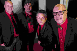
“Green Goblyn Project”
“goblyn”
I think I’ve known GGP in all it’s various incarnations for about five or so years.
Knowing Christ, Rhonda, Meird, and the rest of the gang has been real invigorating for me both artistically and personally. I’d like to believe I’ve done as much for them as they’ve done for me, and it’s been awesome to be able to collaborate with them on various projects.
After this introduction it’d be hard to believe I could be objective about their music, but that’s actually one of the first things that made me excited about hanging out with them.
Well, anyways, they’re finally getting their up-and-commence with people other than myself, and I certainly don’t mind “fueling the fire” while also trying to “round robin” my way into their orbits.
Anyways, the original plan was to create bogus Oscar Meyer stickers and market the band by placing them on actual hot dog packages at stores whenever possible, or scanning an altered hot dog package for a cd cover or something. Whether or not this ever happens remains to be seen.
However, it at least provides some potential schwag for the discirminating Green Goblyn fan via all the GGP merchandise available via cafe press.
“Iceberg Defect In Da House”
“berg”
I don’t think I’d would’ve been as willing to start this column, if I didn’t have such a strong first image. The image had haunted me and practically drew itself. To this day and to myself, it doesn’t really look like something I actually drew.
Believe it or not, I’m not a very big titanic fan. I’m more of a fan of icebergs and a speculator on mass fascination with tragedy.
After the image I came up with the column title, ‘Iceberg Defect,’ and no, it doesn’t stem from “I.D.”, as in identification or identity. I had been playing and had several “false starts” for artwork and zines using the terms defect and defective, both having a hard ‘k’ sound, and imagery which leaves a lot open. Originally, I had intended to publish it as a zine and collaborate with the various artists (mostly artists) and writers I know. (I’m still under the delusion that someday I’ll publish an official ‘Iceberg Defect’ zine.)
With regards to the text, the piece was a direct response to the post-modern “academicization” of the juxtaposition of images for effect. I don’t think a lot of up and coming artists have any “method to their madness” with regards to how they place objects with one another, and, as a result, their art is neither meaningful nor harmonious. (Just an opinion.) I mean I don’t believe in being obscure for the sake of being obscure. I think a lot of the artists who create lowbrow art do so outta true inspiration and not because some professor says, “Wouldn’t it be cool and/or obtuse to have puppet siamese twins vacuuming apples?” Go figure.
As for the title, the “ghetto-speak”, i.e. “indahouse”, it was a kinda an overhyped way of “getting out there.” I couldn’t see where to go with it, and I believe “over-the-top” was better than any hint of resignation. Ultimately, it’s perfectly acceptable because I think it adds to the ambiguity of the column, and I really wanted to keep a level of anonymity to the column, so that people wouldn’t identify it as a single personality or person.
The irony is, I go on and on about how I’m sick of people creating artwork simply to have themselves and others go on and on about it. And here I am going on and on some more. But believe me I don’t really think I could say any more about it as of right…..now.
