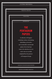
The Pentagram Papers
edited by Delphine Hirasuna
Chronicle
If design agencies were rock bands, Pentagram would be the Beatles. Not only can you can neatly divide things into what came before Pentagram and what happened after, but you can safely say that Pentagram’s influence went way beyond their actual output and deep into the way things were done.
Founded in London in 1972, Pentagram took five partners from varied disciplines and harnessed their creative energies with a business model that was just as creative. Rather than trying to unify the disparate visions each person brought to the agency, Pentagram was structured to allow each partner to pursue their artistic goals, focusing on producing high-quality material, and foregoing any desire to unify the design imperatives of its creatives into some recognizable “Pentagram Style.” Which isn’t to say that there is no Pentragram Style. Continuing with the previous analogy, you can’t say there’s a “Beatles Sound” as much as you can say that someone “sounds like the Beatles.” It’s hard to define, but easy to recognize.
In 1975, the now-successful experiment began publishing a series of monographs, known as Pentagram Papers, for clients and colleagues. Each one was produced by a partner, and focused on a particular interest of theirs, whether it be a type of object, a cultural phenomenon, or subset of the graphic arts. There is absolutely no theme besides “obsession” that unifies the small booklets in this irregular series. For example, No. 27 is “Nifty Places: The Australian Rural Mailbox.” This particular tome consisted of photographs of, well, rural Australian mailboxes, improvised from cans and miscellaneous containers. No. 4, “Face to Face,” collects a series of objects photographed in such a way as to instantly force recognition of a face – eyes, mouth, occasional nose and ears – within these objects. It’s not surprising to see the faces; after all, we apes are highly tuned to recognizing these things. What begins to boggle the mind is the range of expression in these objects. Some are sad, others are amused. None are human.
The Pentagram Papers is not quite a collection of all these slim tomes into a single edition. Rather, it’s a retrospective of this output, featuring photographs of some of the pages of these books instead of the expected straight reprint of the contents. It’s somewhat disappointing to not have a thorough collection of the Papers, but at the same time, these are serious collectors’ items – very limited runs, distributed only to clients and colleagues – and I can understand the desire to maintain that mystique. Besides, a straight collection of these pages would be a burden on any bookshelf and wallet and, well, executing the default concept wouldn’t quite be the Pentagram way of doing things.
However, lest you see this as a fatal flaw, the publishers have compensated with a fantastic bonus: a complete copy of Pentagram Papers 36, “Marks of Africa,” nestled into the back cover. It’s a detail fraught with class, and very very Pentagram.
Chronicle Books; http://www.chroniclebooks.com


