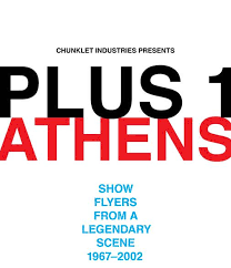
Plus 1: Athens–Show Flyers From A Legendary Scene 1967-2002
Henry Owings
Chunklet Industries
Band flyers are fascinating. Originally something between a disposable art project and information transmission, they now fill galleries and sensibly designed books. I remember sitting in a punk-rock themed restaurant in Las Vegas about 5 years ago under professionally framed flyers that were probably conceived and completed in about 20 minutes 35 years ago, now serving as art as people ate expensive cheeseburgers and drank booze-infused milkshakes.
At their simplest, flyer creators could scrawl out the bands and venue information (often incomprehensible to outsiders: “Behind Greg’s House!” or “Riot House”), maybe slap on a clipping from a Jack Chick tract or photo from an old magazine, make a bunch of copies (only a fraction of which were actually paid for), then post them all over the neighborhood. At their best, they would create intricately designed works of art on 8 ½ by 11” paper, which would be torn down or covered over by new flyers within a week or so, and ultimately forgotten unless someone happened to save a copy for some reason.
Considering how ephemeral these works were, it’s amazing that so many of them have survived the ages, usually from the designers themselves, band members, or just local packrats.
Several books have showcased these flyers, most notably Fucked Up and Photocopied: Instant Art of the Punk Movement, which broke the country down into distinct geographical scenes. While there have been other regional flyer books, none have been as well-designed or informative as Plus 1 Athens: Show Flyers from an Incredible Scene, the newest graphic masterpiece from Henry Owings’s Chunklet Industries.
Owings has been scanning Georgia band flyer collections for years now, settling on over 150 full-color reproductions of Athens, Georgia flyers for the book. No band has more than three entries, and Owings focuses on rarely-reproduced flyers. As Owings states in his introduction, “(t)hose I’ve collected are a shining representation of folk art generated mostly by the musician class in this revered music city.” The University of Georgia’s Special Collections will receive the larger collection, but the result of all this editing and scanning is a simply beautiful book. Each flyer is introduced with full information on the side: the artist, full date (flyers rarely printed the year), and who supplied the flyer. The book is fairly chronological—the first entry is from 1967 (a stark typeset flyer advertising a Spring Dance featuring the Fabulous Jesters), and the next is a 1968 psychedelic lettered flyer with the bottom reading “If you like my poster steal it man.”
Plus 1 Athens documents a wide variety of styles—sometimes you get something like the Art Ensemble of Chicago flyer from 1979, complete with press clippings, ticket, and information phone numbers, sometimes you get a hand drawing with written band information. While certain trends can be spotted (the B-52’s era resulted in lots of hand-colored Xerox and a recognizable “New Wave” font), there is no real progression to speak of. A band in 2000 or 1987 is just as likely to have a hand-drawn mess of a flyer as a well-designed piece of art. No matter how much or little work is behind the individual flyers, the reproduction job is amazing—you can see tape residue and staple holes on some of the more battered flyers, reinforcing the fact that these were primarily created as information devices.
Everyone will have their favorite flyers in the collection—mine are a tie between a striking 1986 Dreams So Real/Glass Eye flyer in red, blue, and yellow reminiscent of a 3-D cartoon, and a Dr. Cup/Dirt flyer with a (non-redacted) student’s poor report card with the note, “Sorry Mr. Cornwell, but you left this out in public. Please don’t sue us and we won’t tell your parents” along with the band information.
The essays in Plus 1 Athens give a sense of historical perspective, from Pylon’s Vanessa Briscoe Hay’s tales of managing copy stores to Michael Lachowski’s essay on how the minimal design associated with post-punk was in large part due to press type, a set of letters that artists would have to rub onto their designs. As Lachowski notes, “the more type you added, the greater likelihood for spacing flaws to occur,” which resulted in a spare, unadorned style. There’s also a helpful map of Athens showing just how much culture was available in a small area.
The first printing of Plus 1 Athens is already sold out, with a repress promised in early 2022. Owings is completing a similar book for Atlanta, and it promises to be equally as well-designed and historically fascinating. Jump on it quick.

